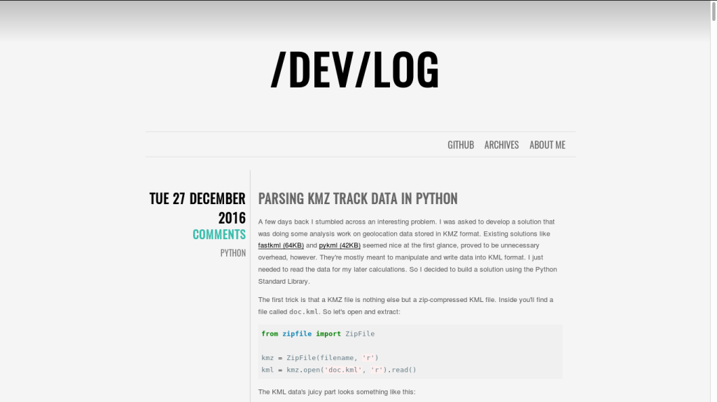
After the exams, I had some free hours so I decided to show my blog some more love and look for a new theme. The old one, a customized version of Chunk was little more than a hack to have a theme at all. Here’s a quick reminder of how this site used to look:
I had a thorough look at Flex, Elegant, and many other popular themes but none of them struck me as really minimalist. So even though I’m more of a backend-dev I decided to dust off my questionable CSS skills and give it a shot. Turns out a lot has changed since I last developed websites. Animations without JS? Magic! The whole thing turned out pretty neat and I even published the code on Github. Feel free to leave feedback!
In this post I’ll explain some of my ideas about Hebe, a “truly” minimalist Pelican blog theme.
Cleaning Up
First I started playing around with the old theme. I removed all things I thought were unnecessary and too distracting:
- Tags
- Author
- Category (probably the most radical change)
- Comments
If I had a search field, I also would have removed it. Whenever I look at a blog I easily get distracted by these elements. I usually stumble across interesting articles through Hackernews or simple Google searches. I look at articles because of their content. I don’t care for other related posts, I would never ever do a tag search, I usually don’t comment and why would I browse a category as generic as programming? Although if they’re too specific they lose their purpose of grouping content. So their relevance is secondary at most. That’s why I removed them from the article view.
Another point that is worth mentioning is the menu length. I decided to go for a maximum of three links. I never visited a blog where I thought “Wow, I should immediately follow them on LinkedIn, Twitter, Facebook, check out their Tumblr blog, like all their YT videos, and donate them some Bitcoin”. I think I’m not alone in this. However when I read an interesting article on a certain programming problem or similar I regularly find myself looking people up on Github to find out whether they have other interesting projects I could learn something from. That’s why I also included mine in the menu above.
Typography
So in my minimalist rage, I needed another way to structure and separate my content than horizontal and vertical rules. My first idea was to use different versions of at most three fonts. On this blog you will find:
- Quicksand in the title
- Raleway for the main content
- Source Code Pro for monospace code sections
All of these fonts convinced me with their smooth curvatures and rounded edges. They manage to maintain a tidy look while not looking as dead and boring as the old Helvetica. Okay, that was mean. Helvetica is a beautiful font. But it’s so overused by now that I’m sick of seeing it everywhere. There are so many beautiful alternatives!
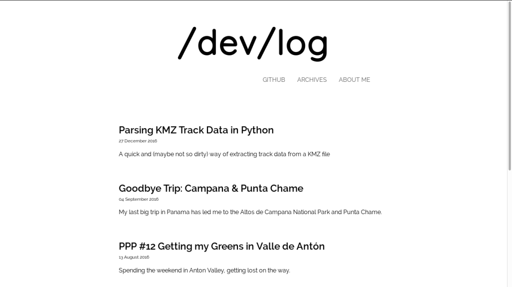
A thing I tried to keep in mind during the design process was to keep generous negative space and guide the reader’s attention indirectly through proximity rather than throwing a UI element at them. After that (plus taking the following thoughts into account) I already ended up with the following black and white theme:
Hidden Functionality
I already wrote about the numerous things that bother me with modern blogs. But removing categories might seem a little radical, right? And the subscription box for a newsletter? What if a user wants to follow my content, explore more or follow the blog?
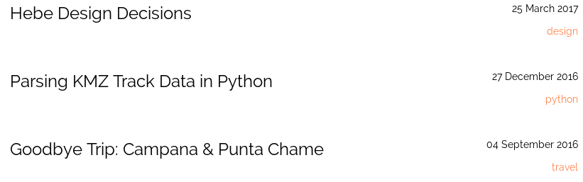
I tried to solve most of these problems by combining different functionalities. For example, personally, I liked the archive view (as long as it’s separated from the rest of the blog). So I decided to merge the archive and categories. When you look at the archive overview you’ll be able to see the respective categories and you can easily explore by clicking on one of them. It’s not too obvious, I know. On the other side, a user who really wants to use this functionality will quickly find their way around it. Even if they don’t – it’s a sacrifice I’m willing to make for a minimalist blogging experience.
For possible followers there are links to Atom and RSS feeds at the bottom. If the reader has read all the content I assume that it interested them and that’s the right point where I want them to see the feed options. When I added colour later I made sure to highlight it a bit more.

Minimalist Colouring
This is a simple one. I presented the first black/ white draft to some of my friends and their main point of critique was that it lacked colour. I quickly went for an orange tone because I liked the contrast that still kept the theme happy and bright. To keep the clean style I just added some accents here and there, though – most importantly highlighting the About Me link in the menu. To still keep the attention on the content in the main view I tried to just add colour at the top and bottom, wrapping the content section in the middle.
When a reader clicks on an article I wanted to allow for more colour. This is mainly because I often share code and syntax highlighting is a must for readability. To KISS I went for a monochromatic scheme. Because I couldn’t find a fitting Pygments style I simply invented my own. Here’s the palette:

If you want to have a look at the complete Pygments style just check out the complete CSS file here.
Few Effects
I admit that most effects weren’t necessary. But I never used animations in CSS3 and this was a good chance to tinker around with them. It all boils down to a limited set of animated elements. The most obvious ones are the slight rotation of the blog title and the colour transitions of the links when hovered. I later found this interesting article by Tobias Ahlin and used the code on my menu bar.
For the content area, I thought that syntax highlighting and font styles were more than enough “noise”. The images looked a little out of place, though. That’s why I added some round corners and slight shadow drops to give them a clean and tidy look – like high-quality photos lying on a polished table.
Further Development
For sure I’ll tweak things here and there. Maybe I’ll also add support for more features to keep up with the more popular and professional themes. For now, it’s getting the job done very well for me. Pull Requests are welcome, of course!.
